Creative Black Country
Category
Arts & culture
Type of work
Brand | Print | Digital | Motion
Creative Black Country (CBC) is a National Portfolio Organisation funded by Arts Council England to bring inspiring arts and culture to communities across Dudley, Sandwell, Walsall and Wolverhampton. Since 2014, CBC has worked with local people to co-create creative projects that celebrate the Black Country’s vibrant culture and community spirit.
The opportunity
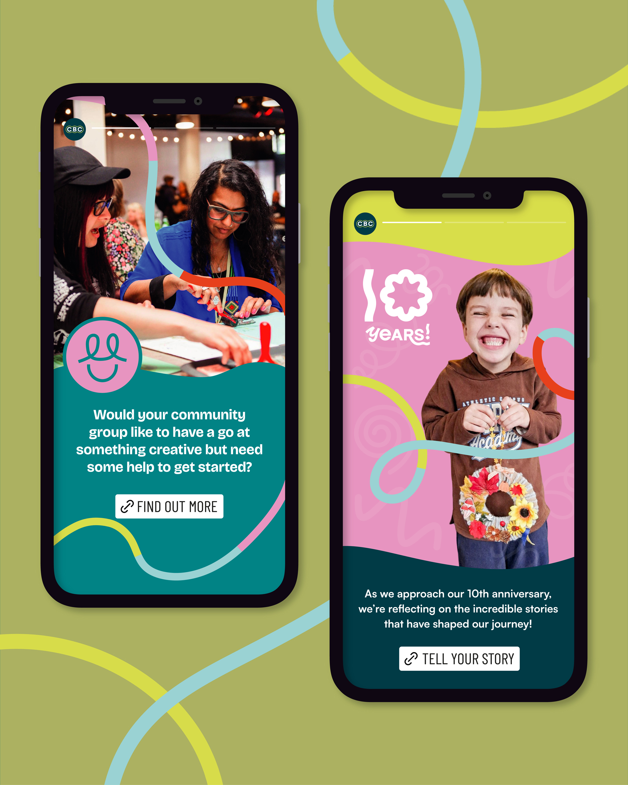
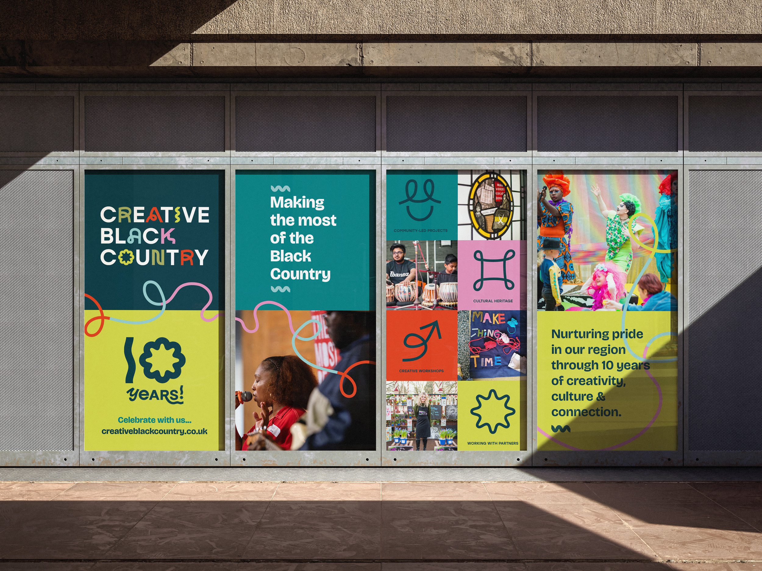
As Creative Black Country approached their 10th anniversary they were looking to celebrate a decade of projects which have fostered local creativity, connected communities and amplified under-represented voices through art and culture. So it felt like the perfect time to refresh the brand — keeping its legacy intact, while creating a dynamic new identity for the future.
Lindsay’s approach to the CBC rebrand is rooted in connection, creativity, and community — three values that sit at the heart of everything CBC does. Inspired by the diverse cultural stories of the Black Country, she created a visual identity that’s playful, energetic, and full of movement, reflecting the collaborations and creative journeys CBC has fostered over the years.
The identity
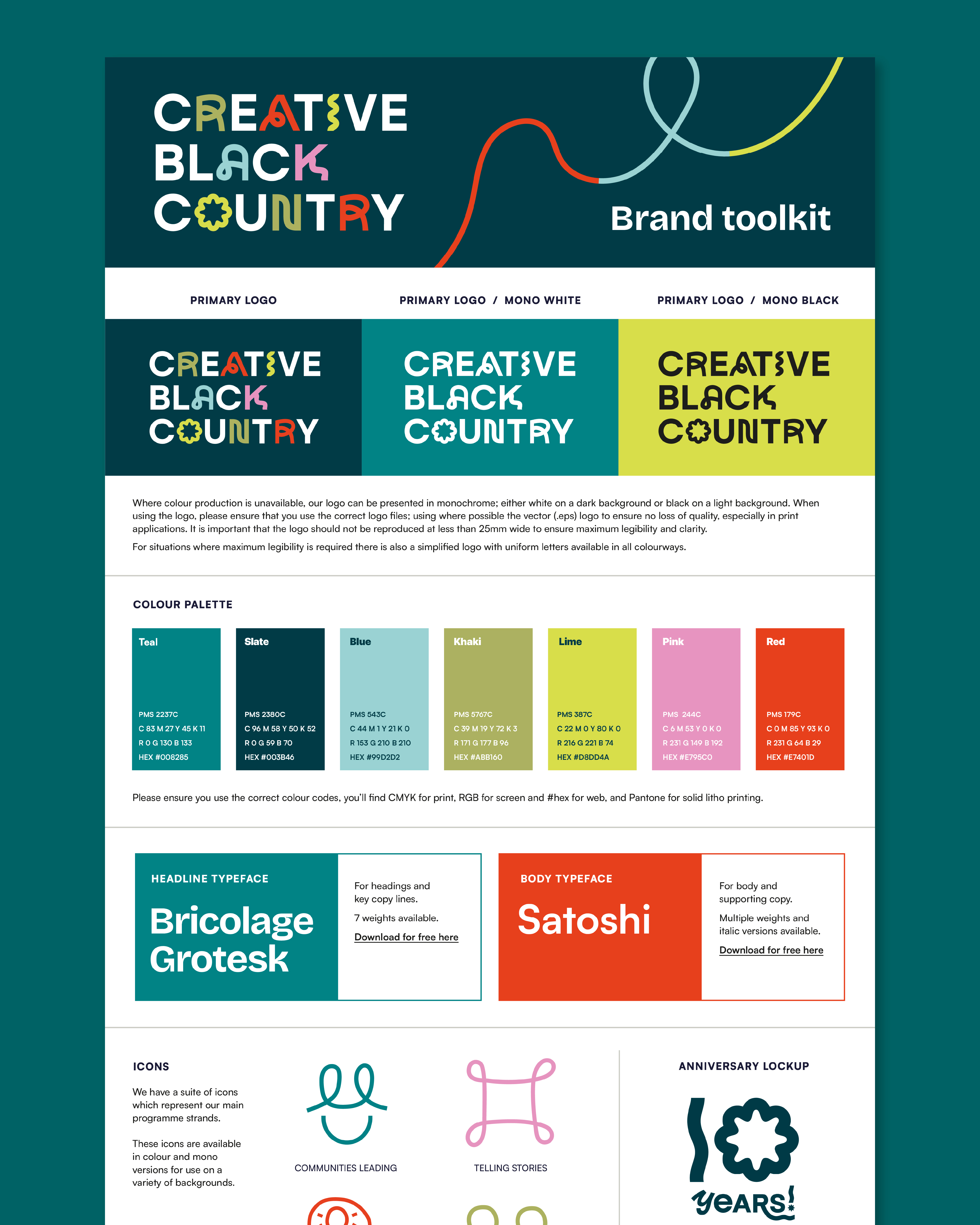
The new brand identity is joyful and fun, featuring looping and playful threads which weave and flow through the designs, changing colour as they progress and linking project imagery and impactful messaging along the way. As a graphic device these threads point to Creative Black Country's role in creating these connections and promoting collaboration across the region, with the result being a wealth of creative projects that celebrate the richness of the Black Country's diverse cultures. This expressive quality of line can also be found in the new logo which features hand drawn letters which inject personality and bright pops of colour.
The colour palette features warm vivid tones which feel inviting and complement the colourful nature of CBC's project photography. Earthy tones of olive, mustard, sky blue and teal are balanced with vibrant red and pink. A characterful and striking typeface creates bold headings and the unique letter shapes echo the curves of the undulating thread. This is paired with a clean and contemporary sans serif for maximum legibility on body copy. A set of line drawn icons, which help to denote programme strands, and a flexible background pattern were also created so everything consistently ties together.
The brand was brought to life through motion by Pica / Dan Silverstone who animated the logo, bringing in lots of looping threads from all directions to create the letterforms, along with the icons and patterns.
A set of animated social media posts/reels and bookend transitions were also created for CBC to use in digital and film content, creating many opportunities to make the brand really jump off the screen.
The new brand feels empowered and expressive whilst maintaining the relaxed and upbeat feel of the organisation. It is joyful and bright to help represent the flourishing cultural scene in the Black Country.


